My name is Hugh. But today we will be talking about color so, today, I am Hue: a person of color. The color palette is such a powerful and unifying element in interior design that it is to a where we start.
In the process of guiding clients through selections and interior design, we start thinking about color by thinking about mood. We want to know the mood that our clients want for their entire home as well as the areas we will be remodeling.
With our hedonic (focused on creating happiness) approach to design we often seek designs that create connection to nature. Though it is a bit tricky, color can play a role in creating this connection by choosing colors outside a window to set the palette. The reason that this can be tricky is that colors in nature change seasonally. Many of those colors will only change in shade and tone allowing an inside color to fit through the seasons. Other colors such as seasonal flowers are only present for part of the year. But this, too, can provide delight that mimics nature. The thrill of the first blooms will be heightened and shared indoors if they match an inside color.
Another way to mimic nature is to use the pattern of color that are found in nature. That is dark floors, somewhat lighter walls and light ceilings.
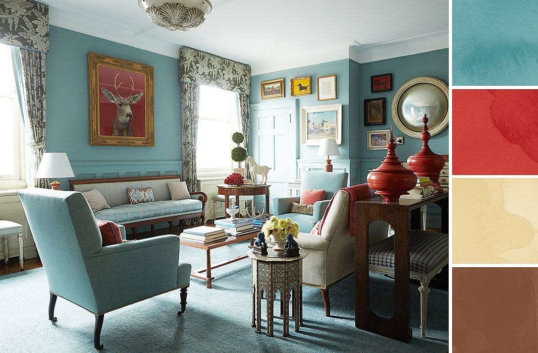
The intentionality of color can also be used to create connection to indoor features as well. Matching colors in a favorite piece of art or furniture can bring a room together in a deep and layered way.
In addition to paying attention to what is happening outwardly it is also good to look inwardly. What are the colors that best flatter you? Just as people tend to pick clothing that is more flattering to their skin tone or hair color, they should also think about dressing themselves in the surroundings of their home.
One strategy is to use color symbolism. For example, choose one color or intensity of color for public areas and another for private areas. Though subtle, this can help inform the intention of the space.
Just as color can create connection to outdoor landscapes or indoor features, it can also help connect interior spaces. The open concept is very popular. At times a designer will want spaces to be open and connected yet distinctive. Color can help create this effect. Likewise, color can help pull together two spaces that are tangential and slightly divided. A line of sight into an adjacent room that uses similar colors can help create connection.
A general rule of interior design is to create a color ratio of 60% of an ambient color; 30% of a highlight color and 10% of an accent color. It is generally discouraged to use more than three colors in a single room… but rules are made to be broken. General rules should not be forced into all situations.
Light colors tend to make small rooms feel lighter and airier. This can also be a good place to create some pop with a bit of a deep color used for accent. A small room using light color can also depend on interchangeable items such as towels to provide accent color thus allowing for easy seasonal changes.
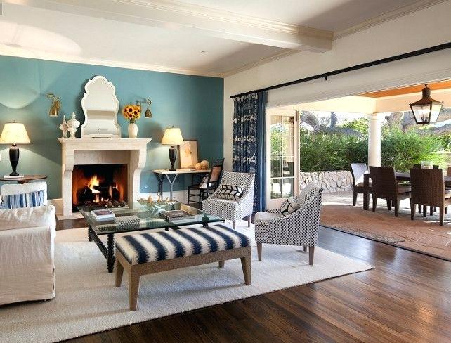
Large rooms provide a great opportunity for an accent wall of a different color. This is a good time to pick up a color from a piece of art, furniture, or something out a window. An accent wall will add interest to a plain room.
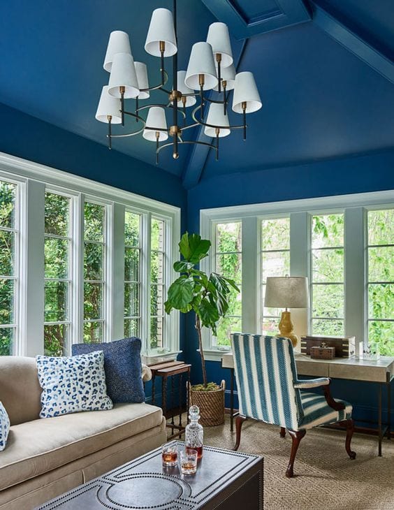
Don’t be afraid of vibrant colors. They can be fun and interesting. And if you don’t like them, you can paint over them. If you tend to be cautious, consider limiting the amount of vibrant color you use rather than eliminating it all together. Even if it is only an accent in a single room a vibrant wall can create a fun surprise.
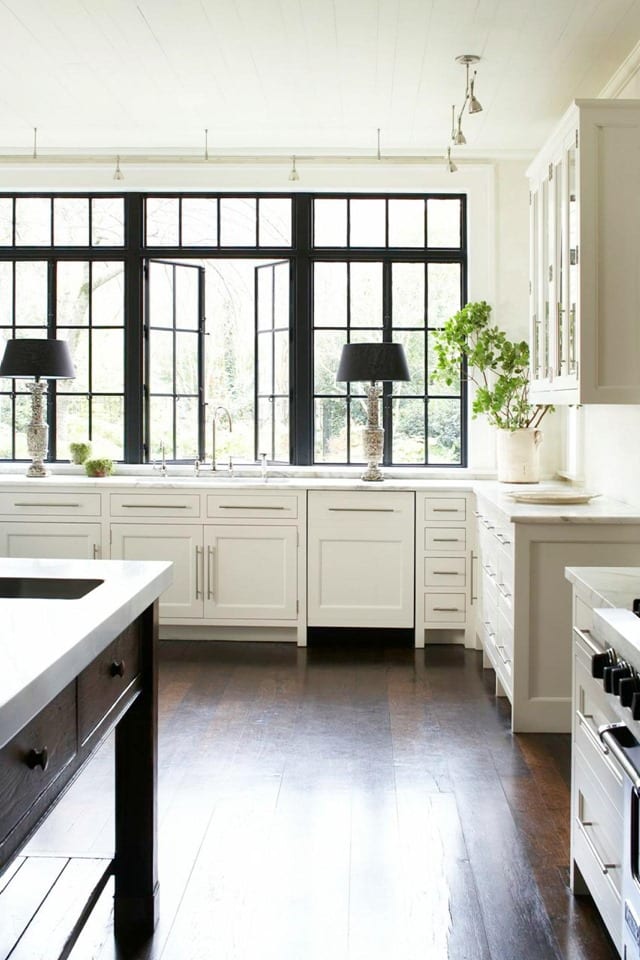
Color can also be used to bring attention to other features as well. A subtle way to do this is lighten or darken the trim or door color by one or two steps from the wall color. For more dramatic appeal use a contrasting color to draw attention. This method adds depth and interest to a space.
Color can help accentuate or create important lines in a design. Consider a long blank wall with a low ceiling. This potentially annoying feature can become a point of interest by lining up photographs in the same size and color frames accentuated by a line that is slightly larger or smaller than the height of the frames and two steps lighter than the wall color, or of a color drawn from the photographs. This will accentuate the linearity of the space and make it interesting.
Use black to create emphasis. It can draw attention to a specific item such as a piece of furniture or it can add emphasis to something in its field of view. A light-colored picture on a black background will pop. Red will become even more dramatic when given a black background. This is to be used sparingly unless you want to create a goth ambiance.
Use the color wheel to your advantage. Colors next to each other create harmony; they tend to be calming and relaxing. Colors opposite each other on the color wheel are complimentary but also create contrast. They insinuate activity and movement.
Stay mindful of lighting. A color will look entirely different in the morning than it does in the afternoon, than it does at night. Added lighting on an accent wall can create a dramatic effect. There is no element in design more important than lighting.
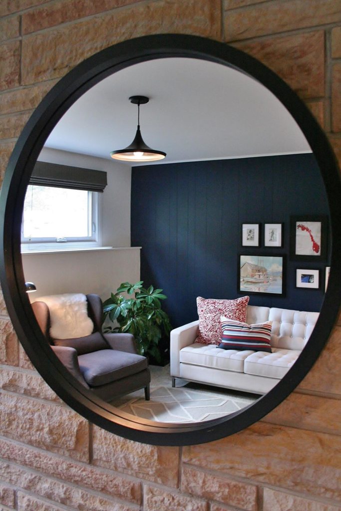
Mirrors can play a nice part in the plan. They provide an opportunity to amplify light as well as color or a dramatic line. Pay attention to what is being reflected in a mirror because it has at least twice the impact that it would without the mirror.