Hey there, design enthusiasts! Can you believe it? We’re still rocking 2023, but guess what’s already making its grand entrance? The paint colors of 2024 have strutted onto the scene, and we’re here for it! In case you missed the memo, every year, the big paint players unveil their “color of the year,” predicting the hottest hues that will set the design world on fire.
So, let’s spill the paint tea, shall we?
The Earthy Evolution:
In recent years, Mother Nature’s favorites – blues and greens – took center stage. But hold onto your paintbrushes, because lately, we’ve been cozying up to warmer shades like beige and red, turning our spaces into comfort cocoons. Neutrals and off-whites are having a moment, wrapping us in a warm, modern hug. It’s a design glow-up, folks, as we move from icy grays to spaces that are as inviting as a warm hug.
At Stearns Design Build, we’re like the Sherlock Holmes of home design, deciphering these color clues to keep our finger on the pulse of where design is headed. But here’s the twist – we don’t just follow the trends; we groove with our clients, curating colors that match their vibes, desires, and must-haves. Let the color adventure begin!
Sherwin-Williams’ Upward SW 6239:
Introducing Upward, a breezy, blissful blue. The color found when we slow down, take a breath, and allow the mind to clear.
Light blue is stealing the spotlight as Sherwin-Williams’ color of the year for 2024! A surprise departure from the warm reds and greens of the past, this brings a warm breeze into the design scene. It’s like a cozy blue blanket for your space, creating zen vibes without the frostiness. Kudos to Sherwin-Williams for going bold with an actual color, breaking free from the off-white avalanche in design.
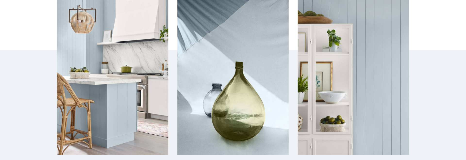
Perfect for various styles – traditional, modern, coastal, farmhouse – Upward is the blue you’ve been waiting for. Just sprinkle it in small doses – think cabinets or accent walls – unless you want your space to do a time warp to “old and stuffy” territory.
Benjamin Moore’s Blue Nova 825:
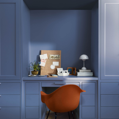
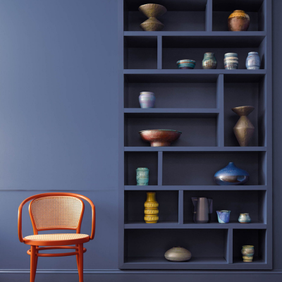
Violet and blue come together in this elevated, sumptuous hue.
Benjamin Moore is surfing the blue wave with Blue Nova, a richer, moodier shade. This bold move is a reminder that it’s okay to embrace bold and saturated colors, even in a sea of warm neutrals. Blue Nova’s deep saturation demands attention but keep it in check – think small accent walls or kitchen island cabinets. Let it shine as a sidekick, not the superhero.
Valspar’s Renew Blue 8003-37D:
A balanced blue color with a touch of grayed sea green that focuses on wellness and comfort.
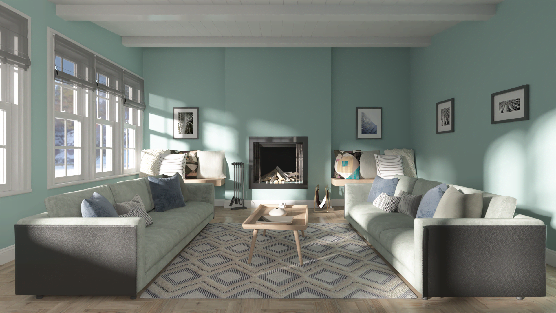
Valspar is all about that “Renew Blue,” favoring a turquoise hue that’s more vibrant than your morning smoothie. It’s a warm, inviting embrace after years of cold, gray living. This color radiates comfort and calm, perfect for accent pieces in traditional, transitional, and bohemian styles. But here’s the plot twist – it’s also the VIP guest at the coastal-style party, bringing beachy vibes wherever it goes.
Behr’s Cracked Pepper PPU18-01:
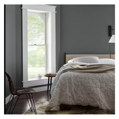
Cracked Pepper is a versatile soft black that elevates any room and the way you feel in it.
Behr’s throwing a curveball with “Cracked Pepper,” a dark and lovely black that’s got a touch of warmth. Breaking free from the blue pack, it’s a versatile player – walls, cabinets, furniture, you name it! This neutral-with-a-kick will cozy up to any color in the spectrum. Get ready to see this dark horse everywhere!
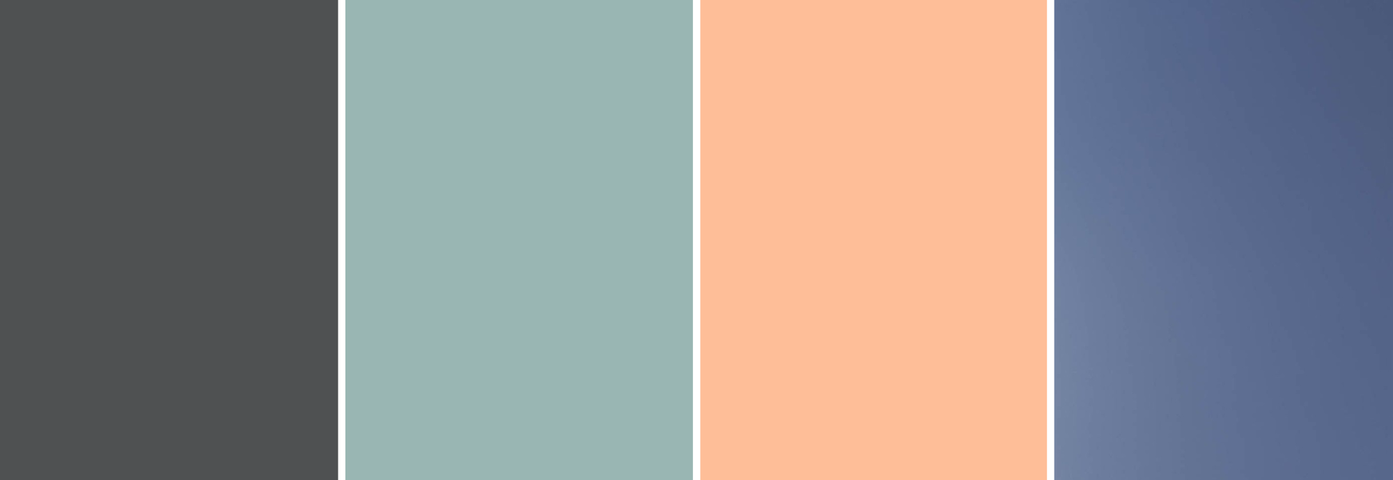
Peach Fuzz captures our desire to nurture ourselves and others. It’s a velvety gentle peach tone whose all-embracing spirit enriches mind, body, and soul.
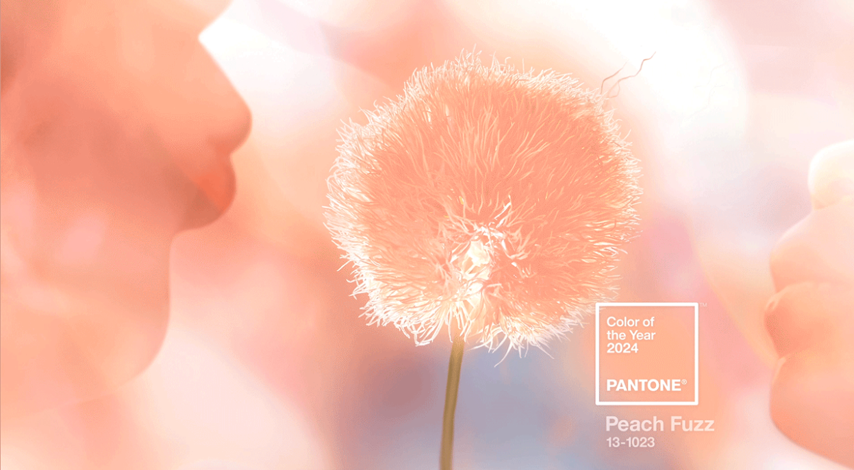
Pantone, not to be outdone, brings us “Peach Fuzz,” a desaturated orange that’s as warm as a peach cobbler. It’s bold but not too in-your-face, fitting right into Bohemian, Scandi, and Mid-Century Modern styles. This hue is all set to make waves in fashion and furniture design – mark our words!
In a nutshell, the theme for 2024 is clear: Warm colors are the MVPs, and it’s time to break free from the beige and gray monotony. Paint your world with hues that spark joy, because, hey, it’s not just about color; it’s about boosting your mood and quality of life. Don’t shy away from the palette – embrace it! We’re itching to infuse these colors into our designs and bring the color party to your homes. Let the vibrant journey begin!
